← Back to Main
Everyday Interface as Systematic Output
4/15/2025, 6:13:05 AM | Jeanyoon Choi
Original Notes (Pre-LLM)
Related to the concept of 'system parameterisation'
Rather than directly depicting the system parameters (as data visualisation), what will be the implicit way to plot the change of data (i.e. system output parameters) subtly, poetically, metaphorically, and artistically?
Everyday interface - not just web ui/digital interface, but literally, everyday interface that we confront - is a result of a complex system/society that we live in. No visual interface - especially if it contaminates some sort of data - can be independent from the outer world, the ever intertwined and dynamically evolving system.
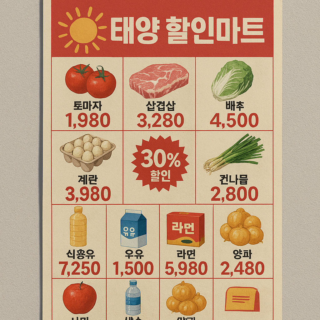
Supermarket Flyer with products and pricing, for example → Pricing: Affected by economic status/policy, Product: Affected by Climate Change, Ecological System, Geopolitical status (Tariffs, etc.), Target Customers (Demographics)
Train Departure Board at Gwangmyeong Station, for example → Technology: KTX (High-speed Train), its speed, Politics: Osong station, the existence of Gwangmeong station, 지방분권/수도권 쏠림: Number of trains heading to seoul, Weather: Delay or cancellation of trains
Other gpt-generated examples (Not so impressive):
Gas Station Price Boards
Vending Machine Inventory Displays
Digital Therometers and Air Quality Displays
Live Bus/Metro Arrival Timetables
Bank/Currency Exchange Rate Boards
Package Delivery Tracking
Restaurant Menus
"Out of Stock"
Smart Home Dashboard "Usage Graph"
What's interesting: These everyday interface represents our everyday 'normal' life, and its interface pretty much displays the same information in short-term (following 'Normal Distribution'). This is the normal 'system' we live in, where we can expect that tomorrow will be the same as today. However, in long-term and/or in Black swan, information these everyday interfaces contaminates changes vastly: Supermarket Flyer changes its products, Train Departure Board shows lots of 'cancellation', due to the act of hyperobject lying beneath the surface data/information. We prefer to call this 'abnormal', 'exception', but in reality, as the volatility/unexpectedness of the system (social, technical, ecological) that we live in becomes more complex & intertwined, these 'abnormal' situations will likely occur more often. Having everyday interface as systematic output- as the A/V output of system art -- is useful to highlight this concerning (or delighting) trend by amplifying its uncertainness/instableness. That the everyday life we know, the everyday interface we interact with, will change in a long-term consequence of our interaction.
Every visual -- every regression-to-mean visuals -- generatable and adjustable, parameterically transformed/interpretable -- representation of systematic output -- One example 태양할인마트
Data Visualisation (Dashboards, graphs) vs. Data Parameterisation → There already exists a system, operating upon parameters, and when parameters change, system functions accordingly
Simple example: 태양할인마트
Interest Change—> 물가변동 —> 전단지 가격, 할인율 변동
Climate change —> 품목변동 —> 전단지상 물품, 농수산물 변동
Global geopolitics —> 수출입변동 —> 품목변동
이렇게 사소한 동네마트 전단지조차 하나의 시스템으로 Data params의 변경을 systematically plot 할수있다.
Everything can be 'everdya interface'
Data Visualisation
Commercial Visuals (Web UIs)
Generative Outcomes
Texts/Typography
Small Multiples
Avatars/Profiles/Simulacre Agents
Network/Map
Or ultimately: All Visual cultures - most representatively Advertisement Visuals!
Now these 'object's are massively generated by AI…. Now the problem is how to associate this with dynamics system output → Making it dynamic, as a part of the system!
Further speculation: Five steps
1. Input → 2. Input Dimensional Transformation → 3. System → 4. Output Dimensional Transformation → 5. Output
This input/output is both 'everyday interface', but the internal system acts as a hyperobject.
EVERYDAY INTERFACE - AUTOMATED INTERFACE
System: Made of the aggregation of 'unit' -- each unit everyday interface
Self-Initiating Automatic System- Using & Repeating Everyday Interface
For example: Calendar, aggregating calendar multiple times (Calendar - symbol of modern time, social time, Gaussian-Descartian notion of absolute time, '명석 판명함', and the symbol of modern slavery -- how many people is bounded by time, and imprisoned by time? 시급, 시간이 없다…)
Aggregating calendar multiple times -- symbol/possibility of liberty from this enslavement? of modern system? How is this possible? 일종의 유희? 워홀적인 유희? 반복법? 최소한계차이? 일종의 시스템들의 반복
평면도 -- 아파트 평면도/조감도 -- 반포자이즘? 그리고 그것의 가격들? (Smth to invetigate further)
Sub-automated UI -- Aesthetically Symphony of Civilisation Movement 3 -- Rapidly changing? The idea for 'Market Economy' where UI interface is detached from the context: Design is detached from the product! Selling apple in luxurious interface!
Function/Graph? Dashboard Aesthetic? Calm dashboard vs. fucked up dashboard? Most representatitve example -- Space Odyssey Hal 9000 "Life Functions Terminated" -- Best example. How to multiply this graph? How to create 'states'? Maybe the easiest way to do this is already there?
Everyday Interface -- Modern Interface? 한남대교 육교의 사례… 수없이 지나가는 많은 차들의 Flux → Flux: 유체역학? Flux of interfaces, flux of 'states' of interfaces
일종의 날파리들 움직이는것처럼? Stochastic? Random-like? 그러나 한남대교를 지나가는 수많은 차들은 개별 행동주체로 합목적성을 가지고 있다… 그 합목적성이 완전 다른 Bird's eye view 로 봤을때 사소해보이고 초라해보이는, 개미떼처럼 보이는것과는 대조적으로,,
English Version (LLM-Generated)
The concept of “system parameterisation” encourages us to think beyond traditional data visualisation. Instead of directly mapping out system parameters as numerical or graphical data, the goal is to depict the evolution of a system’s outputs in a subtle, poetic, metaphorical, and artistic manner.
Consider the everyday interfaces we encounter—not limited to digital screens, but including all the interfaces that mediate our daily experiences. These interfaces exist as manifestations of a complex society and dynamically evolving system. No visual output, especially one that embodies data, can ever be completely detached from the external environment, which is itself in constant flux.
For example, take a supermarket flyer displaying product listings and pricing. Here, the pricing information is influenced by economic factors and policy, while product choices reflect broader issues such as climate change, ecological systems, and geopolitical factors like tariffs and shifting demographics. Similarly, consider the departure board at a train station, such as Gwangmyeong Station. Its display conveys not only the technology of high-speed trains and their schedules but also political decisions regarding station existence, regional development policies, and even weather conditions leading to delays or cancellations.
Other everyday interfaces—ranging from gas station price boards and vending machine inventories to digital displays of air quality or bus arrival times—serve as immediate outputs of larger systematic dynamics. Most of these interfaces follow a “regression to the mean,” presenting a stable, normal distribution of data that reinforces our sense of normality. Yet, under long-term or “black swan” conditions, these outputs can shift dramatically. For instance, a supermarket flyer may suddenly change products or pricing, and a train departure board may display frequent cancellations. These shifts are not mere anomalies; they reflect underlying hyperobjects—vast, interconnected systems that drive ever-increasing volatility and unpredictability in our social, technical, and ecological landscapes.
This perspective encourages us to view everyday interfaces as part of a larger systematic art—a representation of dynamic output. By parameterising data rather than simply visualising it, we can explore how subtle shifts in underlying parameters (economic trends, policy changes, or climate variations) systematically alter the information presented through our everyday interfaces. A practical example is 태양할인마트 (“Taeyang Discount Mart”), where:
• Changes in consumer interest alter price fluctuation and consequently, the discounts and prices displayed in its flyers.
• Climate change directly affects product offerings—particularly in fresh produce and seafood—thereby altering the content of these flyers.
• Global geopolitical shifts impact import and export patterns, ultimately influencing product selection.
In essence, even a modest local supermarket flyer can be seen as a systematically generated plot of data parameter changes.
The everyday interface extends across numerous domains: from dashboards and commercial web user interfaces to generative outcomes seen in typography, small multiples, avatars, network maps, and, perhaps most notably, within advertising visuals. With the advent of AI, these artefacts are being produced at scale, raising the challenge of integrating their outputs into dynamic systems that continuously reflect underlying systemic changes.
A speculative model to understand this process may involve five steps:
1. Input
2. Input Dimensional Transformation
3. System (or the hyperobject underlying the system)
4. Output Dimensional Transformation
5. Output
Both the input and output in this model represent everyday interfaces, while the intervening system operates as a hyperobject with complex, often opaque dynamics.
Consider, for example, the repeated aggregation of simple interfaces like calendars—a symbol of modern time management, social scheduling, and even the constraints of labor and time. By combining multiple calendars, we might question whether we can ever liberate ourselves from these temporal constraints. This aggregation hints at a playful, almost subversive reimagining of standardized systems, challenging the notion of absolute time as both a tool and a form of modern captivity.
In a broader context, visual representations of systematic output, such as floor plans or aerial views of apartment complexes (which have their own market dynamics), further underscore how even the most mundane artifacts are imbued with systemic shifts. Observing the flux of interfaces—whether it is the flow of cars on a busy overpass or the irregular, stochastic movement of small creatures—one can see how individual actions, when aggregated, reveal patterns that might seem insignificant from a high-level perspective, yet are indicative of broader systemic trends.
Ultimately, the evolution of everyday interfaces—transformed over time by hidden parameters—serves as a canvas upon which the dynamic interplay of societal, technical, and ecological factors is continuously enacted. Recognising and interpreting these subtle shifts through the lens of system parameterisation not only deepens our understanding of the systems that govern our lives but also highlights the transformative potential embedded in even the most familiar of our daily interactions.
Korean Version (LLM-Generated)
다음은 ‘시스템 파라미터화’ 개념과 관련하여, 데이터 시각화(direct data visualization)가 아닌 은유적이고 시적이며 예술적으로 데이터 변화(즉, 시스템 출력 파라미터의 변화)를 암시적으로 드러내는 방법에 관한 전문적인 서술이다.
우리가 일상에서 마주하는 인터페이스는 단순한 웹 UI나 디지털 표면을 넘어, 우리가 속해 있는 복잡한 사회·시스템의 산물이다. 그런 의미에서 어떠한 시각적 인터페이스도 외부 세계, 즉 끊임없이 상호작용하며 변화하는 시스템과 독립적으로 존재할 수 없다. 예를 들어, 슈퍼마켓 전단지를 살펴보면 상품 정보와 가격이 표기되어 있는데, 이 가격은 경제정책 및 경제상황에 의해 영향을 받고, 상품 구성은 기후변화, 생태계, 지정학적 상황(예: 관세) 그리고 대상 고객(예: 인구통계)에 따라 달라진다.
또 다른 예시로 광명역의 열차 출발 정보를 들 수 있다. 이 정보판에는 KTX와 같은 첨단 기술, 열차 속도, 정치적 요소(예를 들어 오송역 또는 광명역의 존재 여부), 지방 분권 및 수도권 집중 현상(서울행 열차 수) 그리고 기상 조건(지연 또는 취소) 등이 반영되어 있다.
또한, 주유소 가격판, 자판기 재고 현황, 디지털 온도계와 대기질 표시, 실시간 버스·지하철 도착시간, 은행 및 환율 정보판, 택배 추적 시스템, 음식점 메뉴, 품절 안내, 스마트 홈 대시보드 등 일상의 인터페이스들은 모두 시스템 출력의 한 예시로 볼 수 있다. 이들 인터페이스는 단기적으로 정규분포에 근접하는 ‘평범한’ 정보를 전달하지만, 장기적으로나 블랙스완과 같은 비정상 상황에서는 전단지의 상품 구성이나 열차 출발 정보 등이 급격한 변화를 보인다. 이는 심층에 존재하는 초대규모 객체(hyperobject)에 의해 야기되는 불확실성과 변동성이 증폭되는 현상으로, 우리가 당연하게 여겼던 일상의 인터페이스가 상호작용의 장기 결과로 변화될 것임을 암시한다.
시스템의 출력, 다시 말해 체계 내 파라미터 변화의 가시적 표현은 아래와 같은 단계로 설명할 수 있다.
1. 입력(Input)
2. 입력 차원 변환(Input Dimensional Transformation)
3. 시스템(System)
4. 출력 차원 변환(Output Dimensional Transformation)
5. 출력(Output)
실례로 ‘태양할인마트’를 생각해볼 수 있다. 관심 변화는 물가 변동을, 기후 변화는 품목 구성을, 글로벌 지정학은 수출입 업무 및 이에 따른 품목 변동을 암시하며, 이 모든 요소가 하나의 체계 내에서 데이터 파라미터의 변경으로 체계적으로 표현된다.
즉, 모든 시각적 결과물(데이터 시각화, 대시보드, 그래프 등)은 파라메트릭하게 생성 및 조정 가능하며, 이는 상업적 비주얼(웹 UI)과 생성적 결과물, 텍스트, 타이포그래피, 소규모 멀티플, 아바타 및 프로필, 네트워크 혹은 지도 등의 다양한 시각 문화 요소와 연결된다. 대표적으로 광고 비주얼은 이러한 시스템 출력의 변동성을 반영하는 사례로, 최근 AI에 의해 대량 생성되고 있는 상황에서, 이러한 비주얼들이 동적 시스템 출력의 일부로 어떻게 연계될 수 있는지가 중요한 연구 주제로 떠오른다.
또한, 일상 인터페이스가 자동화된 인터페이스로 기능할 때, 단일 ‘유닛’들이 모여 하나의 시스템을 구성하며, 이 시스템은 자기주도적으로 일상 인터페이스를 사용하고 반복하는 구조를 띤다. 예를 들어, 캘린더는 현대사회의 시간 개념(명석 판명함, 절대 시간 등)을 상징함과 동시에 현대인의 시간에 얽매인 삶을 반영한다. 여러 개의 캘린더가 집합됨으로써, 이러한 속박에서 벗어날 자유의 가능성을 암시할 수도 있다.
이와 같이 평면도, 조감도, 도심 전경과 그에 따른 가격 정보 등도 하나의 시스템 내에서 파라미터 변화로 해석 및 시각화될 수 있다. 나아가 ‘대시보드 에스테틱(Dashboard Aesthetic)’ 개념을 도입할 경우, 평온한 대시보드와 혼란스러운 대시보드 사이의 대비를 통해, 시스템의 불확실성 및 비정상적 상태를 상징적으로 표현할 수 있다. 예를 들어, ‘Space Odyssey’의 HAL 9000이 “Life Functions Terminated”라는 메시지와 함께 보여준 그래프는 그러한 극적인 상태 전환을 상징하는 대표적인 사례이다.
결론적으로, 한남대교 육교에서 차량의 유동적 움직임(Flux)을 관찰하는 것처럼, 일상 인터페이스들은 상호작용하는 개별 행동 주체들이 모여 집합적 행동을 나타내는 동시에, 그 모습은 경우에 따라 유체역학적, 확률적 혹은 무작위적으로 보일 수 있다. 개별 주체들의 합목적성이 거시적으로는 미미해 보일지라도, 그 집합적 효과는 하나의 체계적, 동적인 출력을 나타내며, 이는 현대 사회의 복잡하고 예측 불가능한 시스템 변화를 시각적으로 암시할 수 있는 중요한 방법임을 시사한다.
이와 같은 접근은 기존의 단순한 데이터 시각화(Data Visualisation)와 구별되는 데이터 파라미터화(Data Parameterisation)의 관점에서, 이미 존재하는 시스템이 파라미터 변화에 따라 작동하는 원리를 심도 있게 탐구하고, 이를 예술적 및 은유적 표현으로 승화시키는 시도로 볼 수 있다.
Tags
Everyday Interface Art
Systematic Output Medium
Data Parameterization Art
Implicit Data Representation
Poetic Systems Visualization
Mundane Interface Aesthetics
Normal vs Abnormal States
Black Swan Visualization
Hyperobject Interfaces
Volatility Amplification Art
Interface as System Data
Supermarket Flyer Aesthetics
Timetable Data Art
Calendar Repetition Critique
Interface Aggregation Art
System Units as Interface
Input/Output Transformation
Automated Interface Systems
Advertisement as System Output
Flux of Interfaces
Text written by Jeanyoon Choi
Ⓒ Jeanyoon Choi, 2024