← Back to Main
Data Emotionalisation
9/16/2024, 7:09:05 AM | Jeanyoon Choi
Original Notes (Pre-LLM)
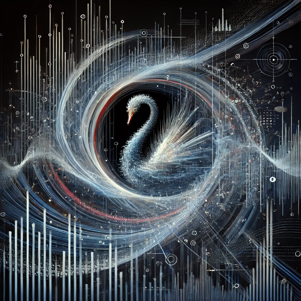
Data: 사회의 부산물, 하이퍼오브젝트의 부산물, 우리가 살고 있는 곳의 Complexitiy를 대변해서 이 Complexitiy와 복합적 역학 상관관계를 쥐어짜서 나온 결과물이 데이터. 이 데이터는 어느 정도 자연적이고, 어느 정도 인공적이다. 때때로는 리니어하게 증가하지만, 블랙스완에 의해예상치 못하게 가변된다. 어느 정도는 정돈되고, 어느 정도는 무작위적이다.
그렇기에 데이터야 말로 가장 컨템포러리한 대상이고, 모더니티의 복잡하고 다층적인 측면을 보여주는, 현대 사회의 산 증인이다.
그동안의 Data Visualisation: 대체로 Explicitly 이러한 데이터를 오디오-비주얼화 하고 있다고 대놓고 쓰고 있었지만, 이는 청중에게 Information을 전달 할 수는 있지만 Emotion을 전달하거나 이 데이터가 만들어놓은 결과물에 순전하게 집중하는데ㅇ는 방해를 할 수 있따… 사람들이 Semantics과 마주하면 그것을 있는 그 자체로 관조/즐기기 보다는 해석하려 들려는 경향성…
나의 목표: 사람들이 이 데이터의 다층적인 구조를 시청각적으로/직관적으로 감각할 수 있도록. 이해보다 감각이 선행하도록…. Climate Data for example —> Accelerated Tension, Accelerated Rhyhtm을 통해 뭔가 심상치 않은 멜로디가 전개되고 있음을 직관적으로 알 수 있다. 어떠한 사전 컨텍스트 없이…. 예술을 즐기고 난 이후 그 컨텍스트를 알 수 있도록. 이것이 동시대를 감각하는 가장 예술적인 방식 아니겠는가?
Implicit Data Visualisation → Data-Emotionalisation. Experiencing Through Data, Communicating with the Audio-Visual Result of the Data, not the Context of the Data itself.
Data Emotionalisation!
Data Visualisation 뿐만 아니라 Data Temporalisation/Data Rhythimification 또한 필요한 이유…
Application 1: Rise & Fall. Rise & Fall Interactive Video-based artwork, people scan the QR and Video WebRTC real-time propagated to TouchDesigner, The face’s position & area span & emotion changes accordingly to the data → If the face becomes economically wealthier it attains more space → Showing the Rise & Fall of one’s life. This graph of rise & fall can use real-company’s stock price data & revenue data…
English Version (LLM-Generated)
Data is a byproduct of society, the remnants of hyperobjects, embodying the complexity of our cohabitation. It's a result produced through the squeezing of such complexities and multifaceted dynamics. Data possesses a certain degree of naturalness and artificiality, its growth can be linear at times, yet it fluctuates unpredictably as influenced by unpredictable and rare events, which we identify as black swans. It is partially ordered, yet partly random.
Data inherently represents the most contemporary subject, for it vividly showcases the intricate and multilayered facets of modernity, acting as the witness of today's society.
Up until now, Data Visualisation has often been about explicitly transforming this data into audio-visual forms. It indeed does communicate the information but potentially distracts from focusing purely on the results that the data has created, particularly in regards to conveying emotion. Whenever people encounter semantics, they tend to focus on interpretation rather than enjoyment and observation of it for what it is.
My goal is to enable people to intuitively perceive the multilayered structure of this data, both audibly and visually. I want sensations to precede understanding - using climate data as an example, one could intuitively notice an unusual melody unfolding through Accelerated Tension, and Accelerated Rhythm, all without any prior context. Realising the context after enjoying the art— isn't this the most artistic way to perceive the modern era?
Implicit Data Visualisation leads to Data-Emotionalisation. We experience through data, communicating with the audio-visual results of the data, not the context of the data itself. We are emoting with data!
Beyond Data Visualisation, it's necessary to progressively engage with Data Temporalisation/Data Rhythmification…
Consider the application of Rise & Fall. It is an interactive video-based artwork where individuals scan the QR code and this leads to real-time propagation of video WebRTC to TouchDesigner. The face's position gesture, span, and emotional expressions change according to the data. As their portrayed 'face' becomes economically more affluent, they acquire more space, depicting the rise and fall of one's life journey. The graphical display of this rise and fall can incorporate real-world data, such as a company's stock price and revenue.
Korean Version (LLM-Generated)
데이터: 이것은 사회의 부산물, 하이퍼오브젝트의 부산물, 우리가 살아가는 공간의 복잡성을 대변하는 존재. 이 복잡성과 복합적 상호작용의 결과로 태어난 것이 바로 데이터. 이것은 자연적인 요소와 인공적인 요소가 얽혀있는 존재이다. 때때로 리니어하게 증가하다가, 블랙스완의 영향으로 예측 불가능한 변동을 보인다. 일부는 정돈되어 있지만, 일부는 무작위적이다.
그러므로 데이터는 바로 현대적인 대상 그 자체이며, 현대 사회의 복잡하고 다층적인 모습을 우리에게 보여주는 산 증인이다.
지금까지의 데이터 시각화: 대부분은 데이터를 명확하게 오디오-비주얼화하려 했던 것들이다. 이 방식은 정보를 전달하는 데는 효과적이지만, 감정 전달이나 데이터로 인한 결과에 순전히 집중하는 데엔 방해가 된다. 사람들은 대체로 의미를 가진 것에 마주하면 그 자체를 관조/즐기기보다는 해석하려 들이는 경향이 있다.
나의 목표: 사람들이 데이터의 다층적인 구조를 시청각적으로, 직관적으로 느낄 수 있게 하는 것. 감각이 이해보다 앞서도록... 예컨대, 기후 데이터를 이용해 가속된 긴장감, 리듬으로 예측치 못한 멜로디를 들키게 하는 것. 사전 컨텍스트 없이, 예술을 즐기고 난 뒤에야 그 배경을 이해하는 것. 이것이 현대를 감각하는 가장 예술적인 방법이 아닐까?
내포적인 데이터 시각화는 바로 데이터 감성화(Dara-Emotionalisation)이다. 데이터를 통한 체험, 데이터의 의미가 아닌 오디오-비주얼 결과와의 소통.
데이터 감성화!
데이터 시각화만이 아니라, 데이터의 시간화(Data Temporalisation)/리듬화(Data Rhythimification) 역시 필요하다.
적용사례 1: 상승 & 하락. 상승 & 하락은 인터랙티브 비디오 기반의 작품으로, 사람들은 QR 코드를 스캔하고, 실시간으로 TouchDesigner에 전송되는 비디오 WebRTC를 이용한다. 진행 과정에서 얼굴의 위치와 크기, 감정 변화가 데이터에 따라 달라진다. 만약 얼굴이 경제적으로 사회적 지위가 높아진다면 더 많은 공간을 차지하게 된다. 이렇게 사람의 삶의 상승과 하락을 보여준다. 이 그래프는 실제 회사의 주식 가격 데이터와 수익 데이터를 이용할 수 있다.
Tags
Data
Data Visualisation
Data Emotionalisation
Data Temporalisation
Data Rhythimification
Audio-Visual
Interactive
TouchDesigner
WebRTC
Rise & Fall
Text written by Jeanyoon Choi
Ⓒ Jeanyoon Choi, 2024